
TRANS TECH
PRODUCT DESIGN SHOWCASE

Small ideas. Distinctive experiences.

24 original app concepts for neighborhood businesses, independent creators and everyday life. Explore the design and practical features behind each idea.

24 original app concepts. Small businesses, useful ideas and a little personality. These are self-initiated design explorations; client projects remain private.

Have an idea of your own?
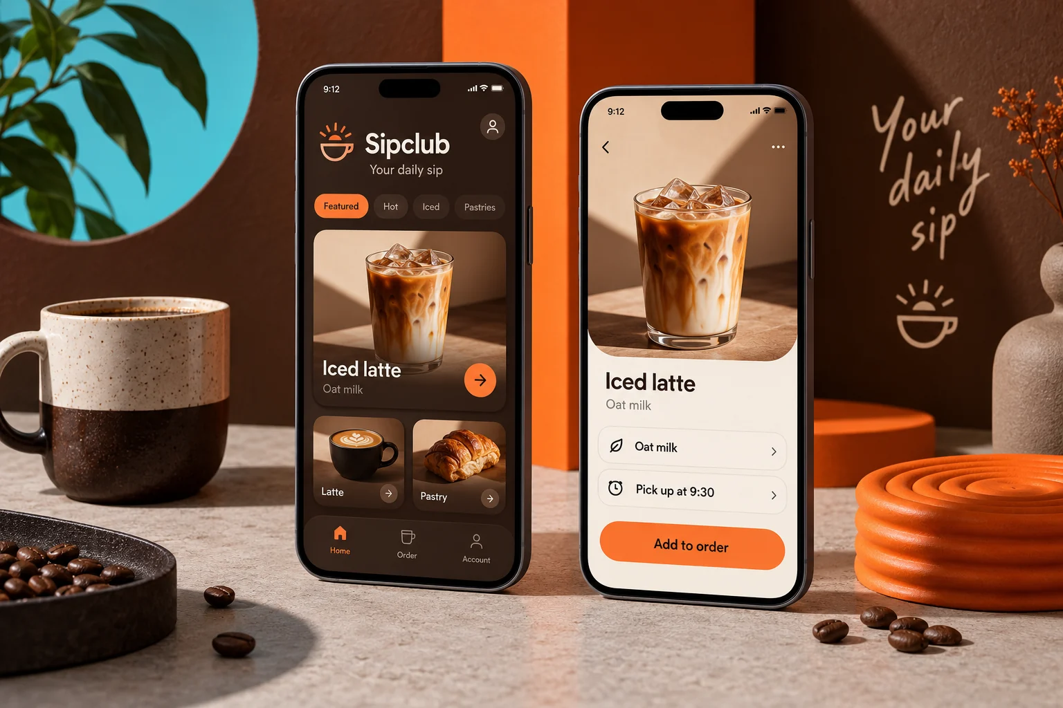
Original Sipclub mobile app concept showing coffee & pickup screens in a colourful studio compositionCONCEPT 01

COFFEE & PICKUP

Sipclub

Your usual. Ready when you are.

A neighborhood coffee shop app for a quick custom order and easy pickup.

Explore this concept

A focused concept for a local café. Customers build their drink, choose a collection time and save their usual order for the next visit.

Proposed features

  • Drink customisation
  • Pickup time selection
  • Saved favourites
SipclubSample app content
Explore Sipclub screens

Pickup at Maple Street

A good morning, made yours.
Honey oat latte

Espresso · oat milk · warm honey

$5.50
Orange cold brew

Citrus peel · slow steeped

$4.75
Almond croissant

Baked this morning · contains nuts

$3.80

Ready around 8:40 AM

Your usual, with a little twist.
Milk & extras

Oat milk · extra espresso shot

Customized
Collection

Maple Street · counter pickup

8:40 AM
Order total

Latte and croissant · before local tax

$9.30

4 of 5 coffee stamps

One more morning to a treat.
Next reward

A regular hot drink on the house

1 stamp away
Saved order

Honey oat latte · oat milk

Your usual
Recent visit

Tuesday · Maple Street

Collected

Illustrative screens and sample data for this design concept.

More inside the experience

Live menu availability

Sold-out items disappear from ordering while saved favorites keep their preferences.

Transparent customization

Milk, size, temperature and extras update the basket price before checkout.

Pickup coordination

Capacity-based time slots and ready notifications reduce crowding at the counter.

Rewards and repeat orders

A stamp wallet, order history and saved drinks make the next visit easier.

A typical user journey

  1. Choose a drink and see ingredients and allergen notes.

  2. Customize, review the price and reserve a pickup time.

  3. Collect the order, receive a stamp and save your usual.

Behind the scenes

A café dashboard would manage menu availability, pickup capacity, order stages and loyalty redemptions. Staff could pause ordering during a rush without deleting the menu.

Design focus. Making a repeat order quick while keeping custom options easy to understand.

  • Local commerce
  • Order flows
  • Loyalty concepts
Let’s discuss your app
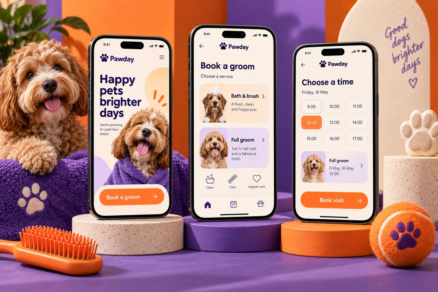
Original Pawday mobile app concept showing pet care screens in a colourful studio compositionCONCEPT 02

PET CARE

Pawday

A happy day for your best friend.

Book a grooming visit, share a pet profile and keep the next appointment in view.

Explore this concept

A friendly booking concept for an independent pet-grooming studio. Owners can compare treatments, choose a time and keep practical care notes with their pet’s profile.

Proposed features

  • Pet profiles
  • Grooming appointments
  • Visit reminders
PawdaySample app content
Explore Pawday screens

Pet profile · Milo, 3 years

A little pampering for Milo.
Freshen up

Bath, brush and nail tidy · 45 min

$38
Full groom

Coat styling and care · 90 min

$65
Meet Jamie

Gentle handling · curly coats

Groomer

Thursday · 10:30 AM

A visit that fits your day.
Selected service

Full groom · medium curly coat

$65
Care notes

Sensitive paws · fragrance-free wash

Shared
Appointment

Jamie · Cedar grooming studio

90 min

Last groom · 6 weeks ago

Keep the next visit simple.
Visit summary

Coat trimmed · nails tidied

Completed
Next reminder

Review appointment availability

Due soon
Pet essentials

Coat type, age and owner contact

Profile

Illustrative screens and sample data for this design concept.

More inside the experience

Individual pet profiles

Store coat type, handling preferences and service history for each pet.

Service matching

Explain treatment duration and size-based pricing before an owner chooses.

Booking flexibility

Reschedule within the studio policy and receive clear confirmation reminders.

Aftercare notes

Share visit photos, grooming notes and the recommended next booking interval.

A typical user journey

  1. Create a pet profile with practical handling preferences.

  2. Compare treatments and choose a groomer and available time.

  3. Receive the visit summary and arrange the next appointment.

Behind the scenes

The studio would see a groomer calendar, pet notes, appointment changes and owner messages. Access to customer contact details would be limited by staff role.

Design focus. Helping owners book the right service with clear pricing and a warm, welcoming flow.

  • Booking UX
  • Pet services
  • Mobile design
Let’s discuss your app
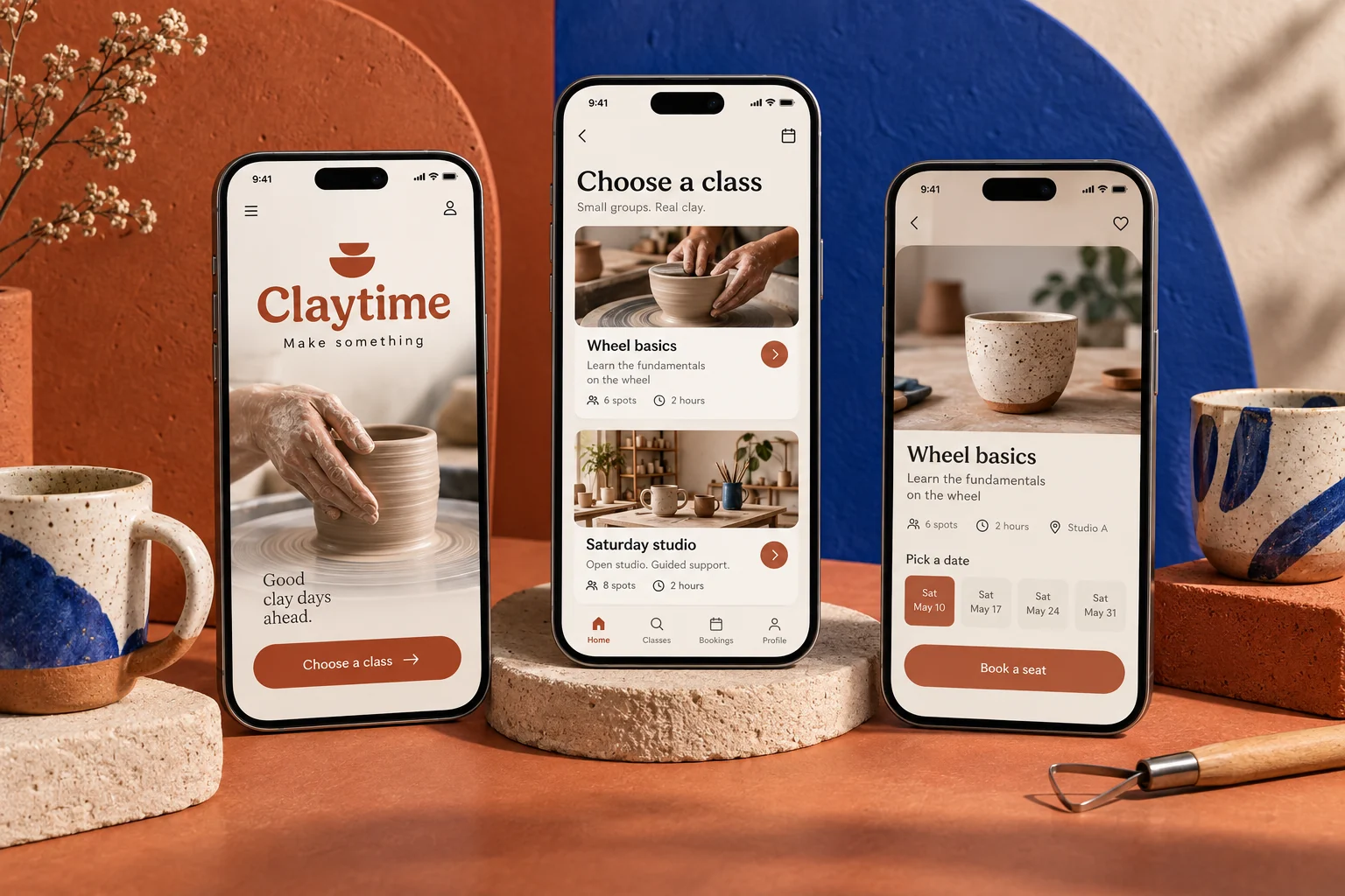
Original Claytime mobile app concept showing creative workshops screens in a colourful studio compositionCONCEPT 03

CREATIVE WORKSHOPS

Claytime

Make something with your hands.

Find a pottery session, reserve a place and see what you will make.

Explore this concept

A booking concept for an independent ceramics studio. Newcomers can browse beginner-friendly workshops, understand what is included and reserve a session.

Proposed features

  • Workshop calendar
  • Skill-level guidance
  • Class reservations
ClaytimeSample app content
Explore Claytime screens

Small groups · materials included

Find your first favorite technique.
First wheel

Beginner wheel throwing · 2 hours

$48
Glaze lab

Color experiments · 90 minutes

$36
Sunday handbuilding

Make a mug and small plate

$42

Saturday · 11:00 AM

A seat at the wheel.
Your workshop

First wheel · instructor Rowan

2 hours
Places

Two adults · beginner friendly

2 seats
What to bring

Comfortable clothes · short nails

Checklist

Two pieces in the studio

Follow your work from clay to shelf.
Speckled mug

Drying before the first firing

In progress
Small bowl

Glazing complete

Ready to fire
Collection window

Studio will send a pickup reminder

Pending

Illustrative screens and sample data for this design concept.

More inside the experience

Skill-based discovery

Browse by technique, difficulty and accessibility information instead of vague class names.

Seat inventory

Reserve individual or group seats, with waiting lists when a workshop fills.

Materials and preparation

Show inclusions, clothing advice, duration and cancellation terms before booking.

Piece tracking

Connect each attendee to drying, firing, glazing and collection updates.

A typical user journey

  1. Pick a technique and review what the session includes.

  2. Choose seats, confirm the date and read the preparation checklist.

  3. Attend the workshop and track finished pieces until collection.

Behind the scenes

A studio workspace would coordinate instructors, seat counts, firing batches and collection messages. Attendance and piece labels would stay linked to the booking.

Design focus. Giving first-time visitors the confidence to choose the right class.

  • Experience booking
  • Creative learning
  • Mobile UI
Let’s discuss your app
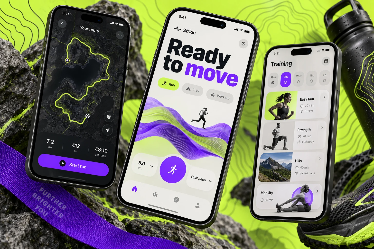
Original Stride fitness app concept with lime, charcoal and purple activity and route screensCONCEPT 04

RUNNING CLUBS

Stride

Your next run starts here.

A companion for a neighborhood running club, bringing weekly routes, meetups and personal progress together.

Explore this concept

A practical concept for a local running community. Members can pick a club route, check the next meetup and review their activity in one energetic interface.

Proposed features

  • Activity planning
  • Route-based experiences
  • Personal progress views
StrideSample app content
Explore Stride screens

This week · Riverside club

Find your pace, find your people.
Easy riverside loop

5 km · conversational pace

Thu 6:30 PM
Saturday social

8 km · coffee stop after

Sat 8:00 AM
Hill practice

Intervals · coached small group

Sun 7:30 AM

5.0 km · mostly flat

Riverside, without the guesswork.
Meeting point

East gate · look for the club flag

Start
Pace group

Easy · regroup at two checkpoints

Selected
Route notes

Water fountain at 2 km · paved path

Useful

2 club runs joined

A steady rhythm beats a perfect week.
Thursday loop

5.0 km · easy pace

Joined
Next meetup

Saturday social · 8:00 AM

Saved
Personal target

Three outings this week

2 of 3

Illustrative screens and sample data for this design concept.

More inside the experience

Pace-aware events

Compare distance, terrain and expected pace before joining a group.

Route preparation

See meeting landmarks, water points and route notes in one place.

Attendance and updates

RSVP, cancel a place and receive changes from the run organizer.

Personal activity log

Record completed outings and private notes without forcing public competition.

A typical user journey

  1. Browse a run that matches your pace and available time.

  2. Review the route, join a pace group and save the meeting point.

  3. Check in with the organizer and log the outing afterward.

Behind the scenes

Club organizers would manage capacity, leader assignments, weather changes and attendance. Location sharing would be optional and limited to the intended event.

Design focus. Making information easy to scan before, during and after an activity.

  • Mobile UI/UX
  • Maps & activity
  • Habit-building flows
Let’s discuss your app
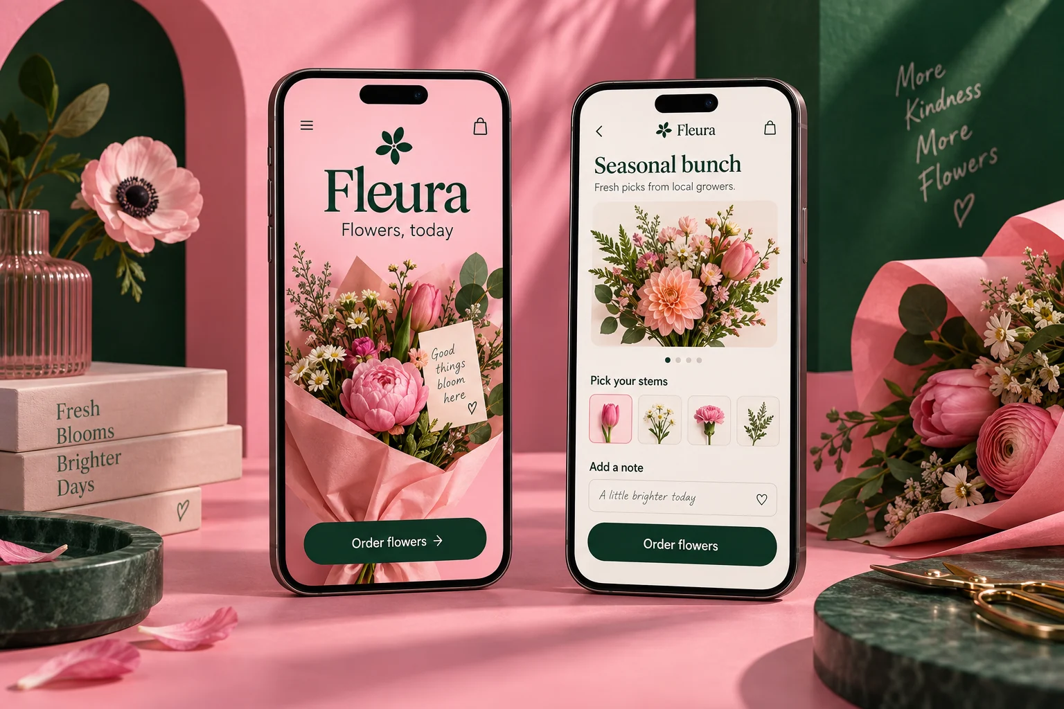
Original Fleura mobile app concept showing flowers & gifts screens in a colourful studio compositionCONCEPT 05

FLOWERS & GIFTS

Fleura

Something lovely, just because.

A local florist storefront with expressive bouquets, gift notes and delivery slots.

Explore this concept

An original app concept for a small flower studio. Seasonal collections lead into bouquet details, a personal card and a clear choice of collection or local delivery.

Proposed features

  • Seasonal bouquets
  • Personal gift notes
  • Delivery slot selection
FleuraSample app content
Explore Fleura screens

Seasonal stems · made locally

A good reason to brighten a day.
Peach morning

Garden-style bouquet · soft peach

$42
Wild little thing

Seasonal mixed stems · small

$28
Green and growing

Potted plant with a ceramic cover

$35

Peach morning · medium

Make it feel like it came from you.
Card message

Thinking of you this week.

Included
Delivery date

Friday · local delivery window

2–5 PM
Finishing touch

Recycled wrap · cream ribbon

Selected

One gift on its way

Thoughtful, from order to doorstep.
Florist preparation

Seasonal stems selected

In progress
Recipient details

Delivery instructions confirmed

Ready
Saved occasion

Anniversary · September 24

Reminder

Illustrative screens and sample data for this design concept.

More inside the experience

Seasonal substitutions

Explain color palettes and acceptable stem replacements before purchase.

Gift personalization

Add card messages, wrapping choices and occasion reminders without extra steps.

Delivery boundaries

Check the local service area, cutoffs and available delivery windows early.

Order reassurance

Show preparation stages and recipient instructions while keeping gift prices private.

A typical user journey

  1. Choose a bouquet size and understand seasonal stem choices.

  2. Write a card and confirm recipient details and a delivery window.

  3. Follow preparation and save the occasion for next year.

Behind the scenes

The florist would manage daily stem availability, order cutoffs, delivery runs and substitutions. Gift messages would print alongside the preparation ticket.

Design focus. Letting vivid product photography lead while making fulfilment details clear.

  • eCommerce UX
  • Gift journeys
  • Product design
Let’s discuss your app
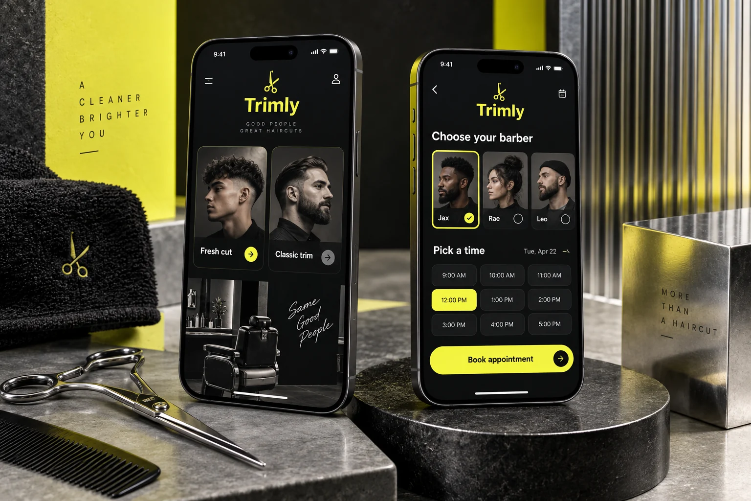
Original Trimly mobile app concept showing barber bookings screens in a colourful studio compositionCONCEPT 06

BARBER BOOKINGS

Trimly

Fresh cut. Clear schedule.

Choose a barber, pick a service and reserve a time without a phone call.

Explore this concept

A streamlined booking concept for an independent barbershop. The journey keeps service duration, the selected barber and the appointment time visible from start to finish.

Proposed features

  • Barber profiles
  • Service selection
  • Appointment calendar
TrimlySample app content
Explore Trimly screens

Oak Street barbers

A sharp cut, without the back-and-forth.
Signature cut

Consultation, cut and finish · 40 min

$32
Beard detail

Shape and tidy · 20 min

$18
Cut and beard

A complete refresh · 60 min

$46

Friday · 4:20 PM

Your chair is waiting.
Your barber

Alex · textured cuts and fades

Selected
Service

Signature cut · 40 minutes

$32
Preference notes

Keep length on top · low fade

Saved

Last visit · 4 weeks ago

The details worth remembering.
Style record

Low fade · natural finish

Saved
Next availability

Alex · Friday afternoon

3 slots
Booking policy

Change up to 12 hours ahead

View notes

Illustrative screens and sample data for this design concept.

More inside the experience

Barber and service matching

Compare specialties, durations and prices with the selected barber visible throughout.

Real appointment capacity

Offer slots based on service length, working hours and breaks.

Saved style preferences

Keep cut notes and optional reference photos attached to the customer profile.

Simple rebooking

Repeat a past appointment and manage changes within a clear studio policy.

A typical user journey

  1. Choose a service and the barber you prefer.

  2. Select a time, add style notes and confirm the appointment.

  3. Save the visit details and rebook when it is time for a refresh.

Behind the scenes

The shop would manage chair schedules, walk-in buffers, no-shows and customer preferences. Each barber could view their own day without seeing unrelated staff records.

Design focus. Keeping the booking journey short and making time commitments clear.

  • Appointment UX
  • Local services
  • Mobile design
Let’s discuss your app
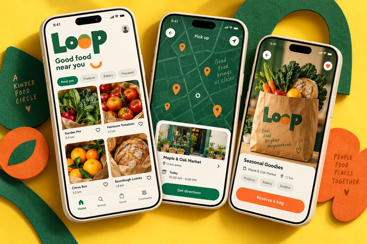
Original Loop food-rescue concept with yellow and emerald mobile screens showing local food offers and pickup detailsCONCEPT 07

NEIGHBORHOOD FOOD

Loop

A good find, close to home.

A pickup app for a handful of neighborhood cafés offering their end-of-day food bundles.

Explore this concept

A local food concept connecting nearby cafés with people looking for a pickup offer. Clear collection times and straightforward reservations keep the experience practical.

Proposed features

  • Nearby food discovery
  • Clear pickup windows
  • A simple reservation journey
LoopSample app content
Explore Loop screens

Pickup offers near Market Square

Good food deserves another plan.
Bakery surprise bag

Bread and pastries · 0.4 miles

$5
Lunch bowl selection

Vegetarian options · 0.7 miles

$6
Produce box

Seasonal fruit and vegetables

$8

Bakery surprise bag

Know exactly when to collect.
Collection window

Today · Market Square bakery

5–6 PM
Dietary information

Contains wheat · contents vary

Read first
Your reservation

One bag · show pickup code

Reserved

Reservation LP204

One less thing left behind.
Collection code

Show at the bakery counter

LP204
Directions

Entrance beside the flower stall

0.4 miles
Your history

Three previous pickups

Collected

Illustrative screens and sample data for this design concept.

More inside the experience

Clear collection windows

Prioritize pickup times, walking distance and remaining quantity in every offer.

Honest contents

Distinguish fixed items from surprise selections and present dietary notes clearly.

Reservation handling

Confirm availability, generate a collection code and explain cancellation rules.

Partner inventory

Let participating shops adjust quantities and mark reservations as collected.

A typical user journey

  1. Find a nearby offer that fits your dietary needs and schedule.

  2. Reserve an available portion and review the collection window.

  3. Show the pickup code at the shop and complete the collection.

Behind the scenes

Partner cafés would publish limited quantities, manage pickup windows and record collection. Availability would update when reservations are cancelled or fulfilled.

Design focus. Making availability, location and collection details clear at the point of decision.

  • Marketplace UX
  • Local discovery
  • Reservation flows
Let’s discuss your app
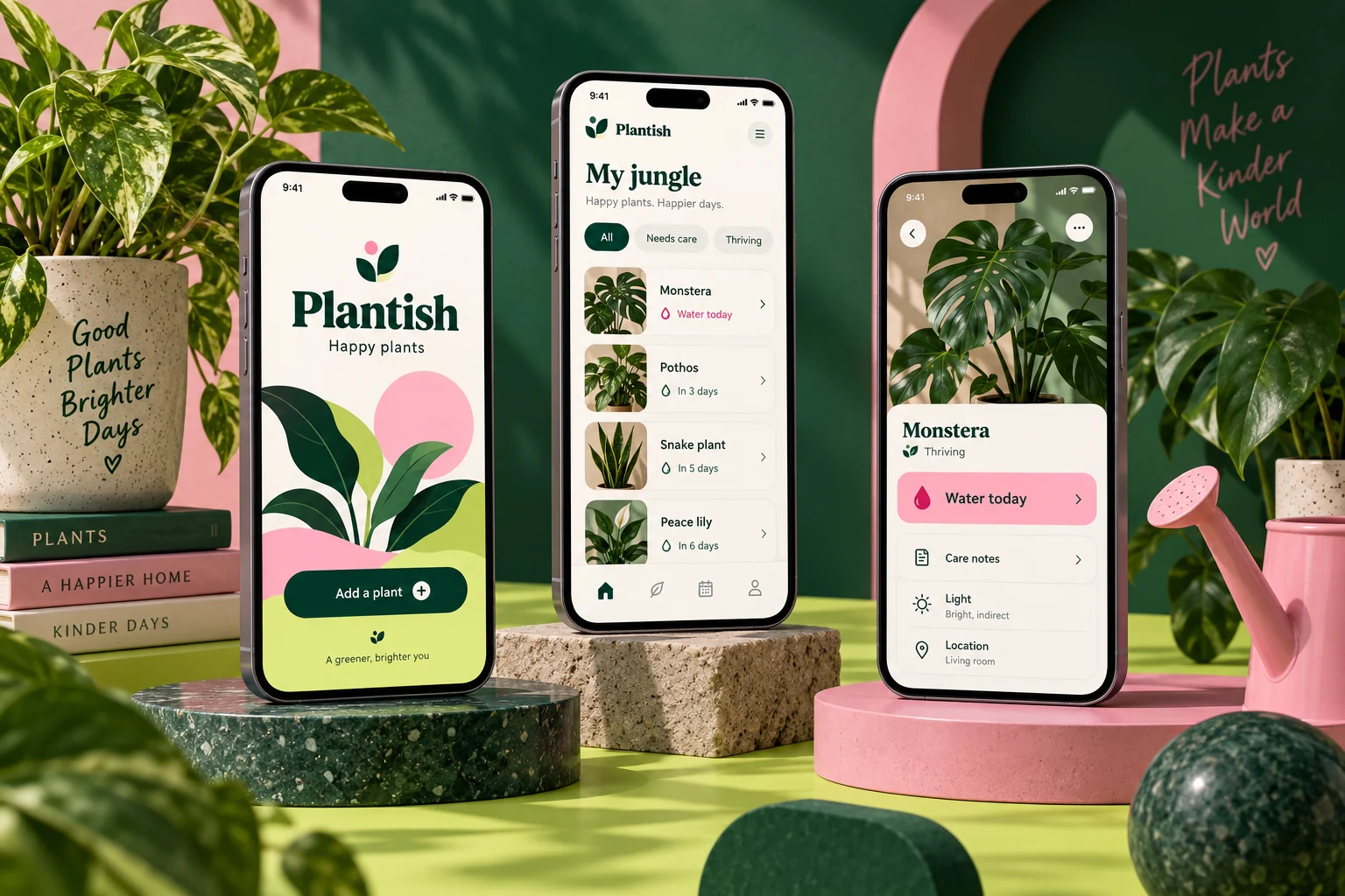
Original Plantish mobile app concept showing plant care screens in a colourful studio compositionCONCEPT 08

PLANT CARE

Plantish

A little care goes a long way.

Keep your houseplants together with simple care notes and gentle reminders.

Explore this concept

An original companion for a small plant shop’s customers. Owners add their plants, follow the shop’s care guidance and keep a photo journal as their collection grows.

Proposed features

  • Personal plant shelf
  • Care reminders
  • Photo journal
PlantishSample app content
Explore Plantish screens

Your collection · 6 plants

A little green, a little attention.
Milo the monstera

Bright indirect light · living room

Check soil
Kitchen pothos

Trailing vine · shelf by the window

Doing well
Small jade

Sunny spot · terracotta pot

Rest day

Monstera · care overview

A useful plan for this plant.
Water check

Feel the top layer before watering

Today
Light notes

Bright indirect light · avoid hot glass

Guide
Your observation

New leaf opening this week

Journal

Monstera · 4 entries

Small changes, easy to notice.
New leaf

Photo added · September 7

Growth
Moved nearer window

Light observation saved

Note
Repotted

Larger pot with drainage

Care event

Illustrative screens and sample data for this design concept.

More inside the experience

Room-based collections

Organize plants by room, pot and light conditions instead of a flat list.

Flexible care reminders

Use check-in prompts that owners can snooze or adjust to actual conditions.

Photo journals

Compare dated photos, repotting notes and observations over time.

Shop guidance

Connect each plant to the shop’s practical care guide and support contact.

A typical user journey

  1. Add a plant and record where it lives.

  2. Follow a care check-in and note what you observe.

  3. Save a photo and adjust the next reminder to suit the plant.

Behind the scenes

The plant shop would maintain care guides, product links and customer questions. The concept would avoid presenting image recognition or care advice as guaranteed diagnosis.

Design focus. Making regular care approachable through clear routines and friendly guidance.

  • Lifestyle design
  • Reminders
  • Personal collections
Let’s discuss your app
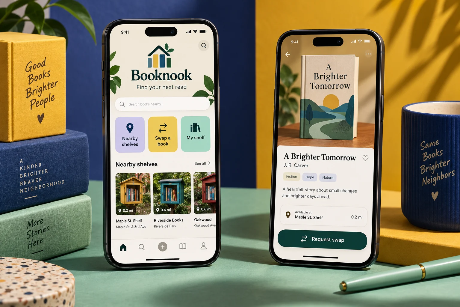
Original Booknook mobile app concept showing book communities screens in a colourful studio compositionCONCEPT 09

BOOK COMMUNITIES

Booknook

Your next read might live next door.

A small community book exchange for sharing a shelf and arranging local swaps.

Explore this concept

An original concept for a neighborhood reading group. Members list a few books, browse available titles and agree a practical exchange through the community.

Proposed features

  • Personal bookshelves
  • Local book discovery
  • Swap requests
BooknookSample app content
Explore Booknook screens

Oak Lane reading circle

Your next read might be next door.
The Lantern Street

Contemporary fiction · paperback

Available
A Map of Small Things

Travel essays · good condition

Swap
The Weekend Garden

Practical gardening · illustrated

Lend

The Lantern Street

A simple, friendly exchange.
Book condition

Light cover wear · clean pages

Good
Exchange option

Swap for a title on the wish list

Swap
Meeting suggestion

Community library · Saturday

11:00 AM

3 listed · 1 exchange agreed

Keep the story moving.
A Map of Small Things

Listed for exchange

Available
The Lantern Street

Meeting agreed with a member

Saturday
Reading circle

Next discussion · local library

Saved

Illustrative screens and sample data for this design concept.

More inside the experience

Useful book listings

Include edition, format, condition and lending or swapping preferences.

Exchange requests

Offer an alternative book and agree a public meeting point through a structured flow.

Community moderation

Report unsuitable listings and restrict contact details to agreed exchanges.

Personal reading shelf

Track listed, borrowed and saved books with return-date reminders.

A typical user journey

  1. List a book with a condition note and exchange preference.

  2. Request a title and agree the exchange details.

  3. Meet at the agreed public location and update both shelves.

Behind the scenes

Circle moderators would review reports, manage membership and publish reading events. The catalogue would use original placeholder titles or permitted bibliographic sources.

Design focus. Making availability and condition easy to scan without a complicated marketplace.

  • Community UX
  • Catalog design
  • Exchange flows
Let’s discuss your app
Original Roam travel concept with aqua and coral mobile screens, a coastal stay and trip planningCONCEPT 10

WEEKEND GETAWAYS

Roam

Make room for a small escape.

A boutique travel guide for weekend escapes, with a curated set of stays and a simple trip planner.

Explore this concept

An original concept for a small travel operator. A considered selection of destinations, useful stay details and saved itineraries help guests plan a manageable weekend away.

Proposed features

  • Destination discovery
  • Saved places & collections
  • A connected trip overview
RoamSample app content
Explore Roam screens

Two nights · close to home

A weekend that feels like a break.
Harbor Hideaway

Coastal studio · sleeps two

From $140
Pine Cabin

Woodland stay · fireplace

From $120
Old Town Loft

Walkable cafés · quiet street

From $135

Harbor weekend · 2 nights

Less searching, more looking forward.
Friday arrival

Check in after 3 PM

Saved
Saturday walk

Cliff path · 90 minutes

Itinerary
Sunday morning

Local bakery before checkout

Idea

Your coastal weekend

Everything for the way there.
Stay details

Address and arrival instructions

Ready
Packing notes

Walking shoes · light rain jacket

Checklist
Saved places

Bakery, beach and sunset viewpoint

3 places

Illustrative screens and sample data for this design concept.

More inside the experience

Practical stay comparison

Show guest capacity, accessibility notes, full price context and cancellation terms.

Lightweight itineraries

Arrange saved activities by day without turning a weekend into a rigid schedule.

Shared trip planning

Invite a travel companion to contribute places and review the plan.

Arrival essentials

Keep booking references, directions and check-in instructions together.

A typical user journey

  1. Compare a short list of stays against your dates and budget.

  2. Save a stay and build a simple day-by-day plan.

  3. Keep arrival information and useful places in the trip folder.

Behind the scenes

A small travel operator would maintain stay availability, supplier details and guest requests. Any confirmed reservation or payment would require integration with the booking provider.

Design focus. Bringing inspiring imagery and practical planning details into the same experience.

  • Travel UX
  • Visual discovery
  • Booking-flow concepts
Let’s discuss your app
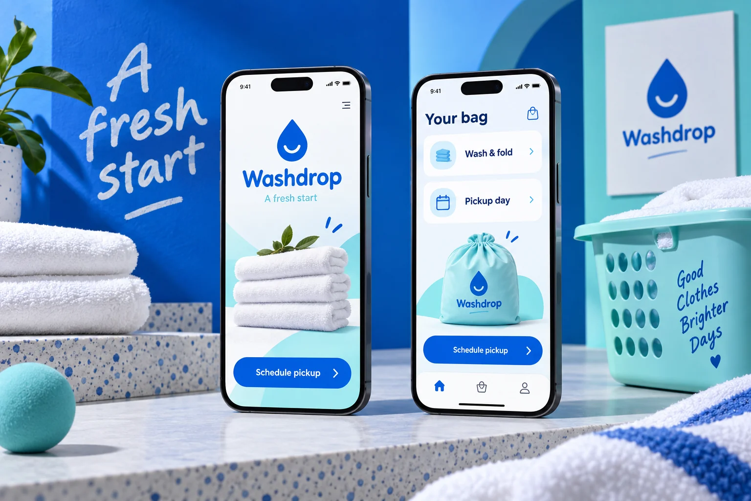
Original Washdrop mobile app concept showing laundry pickup screens in a colourful studio compositionCONCEPT 11

LAUNDRY PICKUP

Washdrop

Fresh laundry. One less errand.

Arrange a pickup, choose your service and check when your laundry is coming back.

Explore this concept

A local laundry-service concept with a straightforward collection flow. Customers select a service, provide pickup instructions and follow their order through to return.

Proposed features

  • Service selection
  • Pickup instructions
  • Order tracking
WashdropSample app content
Explore Washdrop screens

Collection in your neighborhood

Laundry, back off your list.
Wash and fold

Everyday laundry · priced by weight

$2.20 / lb
Shirts

Wash, press and hang

$4 each
Bedding refresh

Duvet cover and sheet set

$18

Wednesday · 6–8 PM

A collection that fits around you.
Service selection

Wash and fold · estimated bag size

Medium
Care preferences

Fragrance-free detergent · low heat

Saved
Pickup note

Ring apartment 4B · use side entrance

Ready

Order WD108

From doorstep to drawer.
Collected

Wednesday · 6:42 PM

Complete
Cleaning

Weight confirmed · preferences checked

In progress
Return delivery

Friday · 6–8 PM

Scheduled

Illustrative screens and sample data for this design concept.

More inside the experience

Clear service pricing

Separate weight-based estimates from per-item services and show adjustment rules.

Pickup instructions

Save access notes, contact preferences and reusable collection addresses.

Care preferences

Capture detergent and drying choices with garment-specific exceptions.

Stage tracking

Follow collection, weighing, cleaning, packing and return with issue reporting.

A typical user journey

  1. Choose a service and review how the final price is calculated.

  2. Set a pickup window and add garment care instructions.

  3. Track the order and confirm receipt after delivery.

Behind the scenes

The operator would organize driver routes, item counts, weight adjustments and cleaning stages. Staff would flag damaged or specialist garments before proceeding.

Design focus. Keeping pickup windows and order progress easy to find.

  • Service commerce
  • Order tracking
  • Mobile UX
Let’s discuss your app
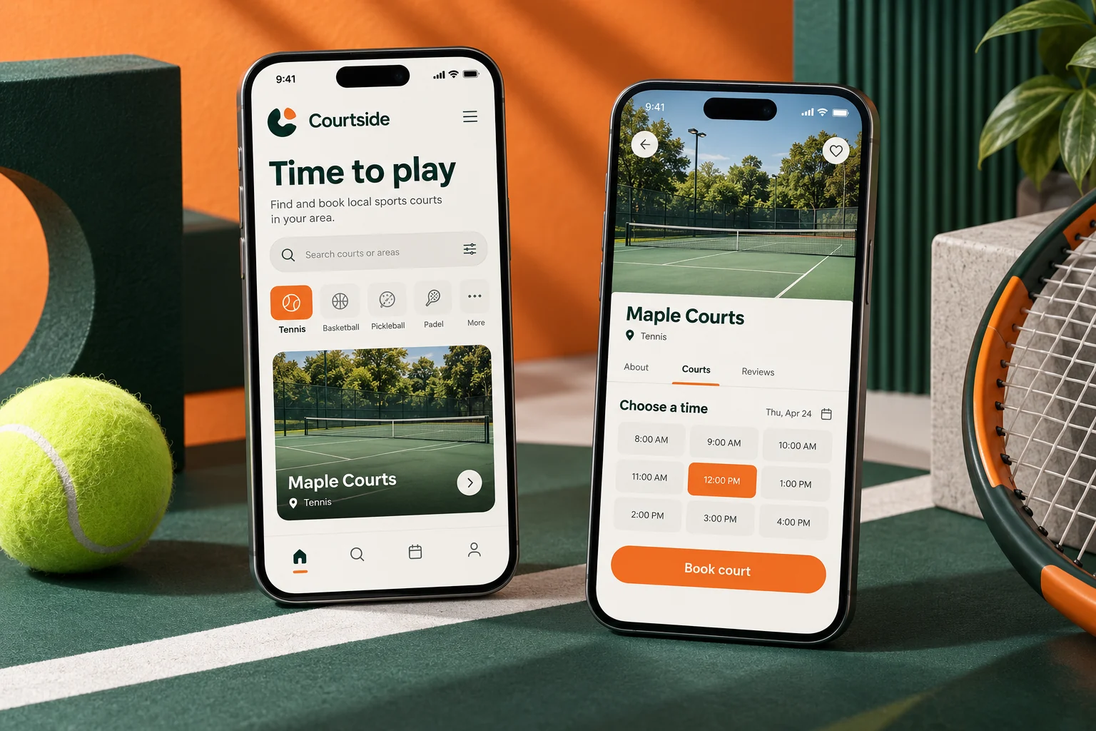
Original Courtside mobile app concept showing sports bookings screens in a colourful studio compositionCONCEPT 12

SPORTS BOOKINGS

Courtside

Less organising. More playing.

Reserve a local court and share the session details with your playing group.

Explore this concept

A booking concept for a neighborhood sports venue. Players can choose a sport, compare open slots and keep their court reservation close at hand.

Proposed features

  • Court availability
  • Session reservations
  • Shareable booking details
CourtsideSample app content
Explore Courtside screens

Westside sports center

Make room for a good game.
Court 1 · tennis

Outdoor hard court · lights

6:00 PM
Court 3 · badminton

Indoor · doubles friendly

6:30 PM
Court 5 · pickleball

Outdoor · equipment available

7:00 PM

Tennis · Court 1

Your next match is taking shape.
Reservation

Thursday · 6–7 PM

60 min
Players

Invite up to three friends

2 confirmed
Equipment

Two rackets available to rent

$6

Thursday · Court 1

Ready when your group is.
Check-in reference

Show at the reception desk

CS214
Group status

Two confirmed · one invitation pending

Players
Venue notes

Arrive 10 minutes early · bring water

Reminder

Illustrative screens and sample data for this design concept.

More inside the experience

Sport-specific availability

Filter by surface, lighting, accessibility and equipment availability.

Group coordination

Invite players and display responses alongside the booking.

Equipment add-ons

Reserve rental equipment with clear quantities and return requirements.

Venue policy handling

Explain weather, cancellation and late-arrival rules before confirmation.

A typical user journey

  1. Choose a sport, court type and open time.

  2. Reserve the court and invite the other players.

  3. Review check-in instructions and collect any rental equipment.

Behind the scenes

Venue staff would manage court closures, recurring bookings, equipment stock and reception check-in. Weather changes could trigger rescheduling options for outdoor courts.

Design focus. Making time, venue and session duration easy to compare.

  • Sports UX
  • Scheduling
  • Reservations
Let’s discuss your app
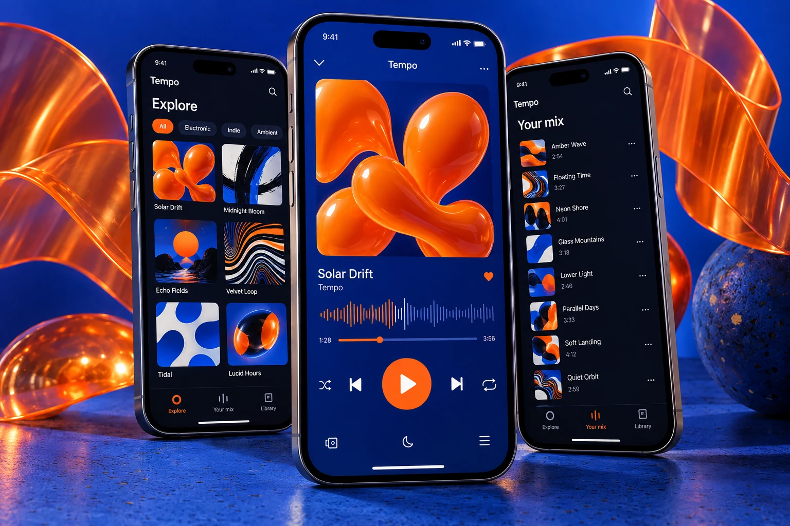
Original Tempo music app concept with vivid cobalt and orange discovery, playlist and player screensCONCEPT 13

INDIE MUSIC

Tempo

A home for your local sound.

A listening app for an independent music collective, with new releases, mood playlists and artist profiles.

Explore this concept

A focused concept for a small music collective sharing its own licensed tracks. Listeners can discover artists, save a collection and settle into a simple player.

Proposed features

  • Mood-led discovery
  • Personal collections
  • A focused listening view
TempoSample app content
Explore Tempo screens

Independent artists · licensed tracks

A new sound from around the corner.
Night Bus

Mira Vale · electronic

3:24
Sunday Windows

The Paper Hours · indie

4:10
Blue Arcade

Juniper Keys · instrumental

2:58

Night Bus · Mira Vale

Let this one play a little longer.
Now playing

Original studio release

1:08 / 3:24
Up next

Blue Arcade · Juniper Keys

Queue
Artist note

Written on late journeys across the city

Story

2 playlists · 8 saved tracks

Your own corner of the catalogue.
Late walk

Five tracks · quiet city energy

Playlist
Sunday desk

Three instrumental tracks

Playlist
Mira Vale

New releases added to your feed

Following

Illustrative screens and sample data for this design concept.

More inside the experience

Artist-led discovery

Give small artists space for release stories, credits and original artwork.

Queue and playlist tools

Reorder tracks, save favorites and build personal listening collections.

Playback continuity

Keep track position and audio controls consistent when browsing the catalogue.

Rights-aware publishing

Track permissions, release availability and territory restrictions for each upload.

A typical user journey

  1. Find a release through a genre or artist story.

  2. Listen, add tracks to the queue and save a favorite.

  3. Build a playlist and follow the artist’s next release.

Behind the scenes

The collective would manage artist profiles, licensed audio, release schedules and takedowns. Sample artist and track names here are fictional demonstration content.

Design focus. Balancing expressive visual design with familiar, accessible playback controls.

  • Product design
  • Mobile experience
  • Content discovery
Let’s discuss your app
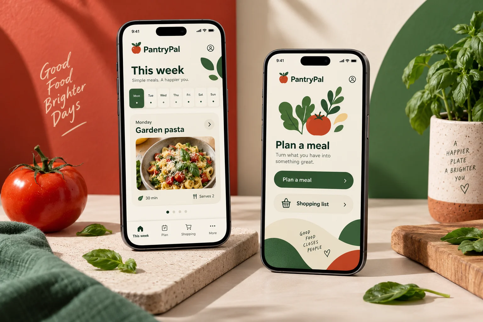
Original PantryPal mobile app concept showing meal planning screens in a colourful studio compositionCONCEPT 14

MEAL PLANNING

PantryPal

A good week starts in the kitchen.

Plan a few meals, reuse ingredients and bring your shopping list together.

Explore this concept

A lightweight household planning concept. A weekly meal board connects favourite recipes with a simple ingredient list, helping users decide what to cook next.

Proposed features

  • Weekly meal board
  • Recipe collections
  • Combined shopping list
PantryPalSample app content
Explore PantryPal screens

Three evenings planned

Dinner starts with a small plan.
Lemon chickpea bowls

25 min · pantry friendly

Monday
Roasted tomato pasta

30 min · serves two

Tuesday
Crispy vegetable wraps

20 min · use leftover greens

Thursday

25 minutes · 2 servings

Lemon chickpea bowls.
From your pantry

Chickpeas, olive oil and rice

Available
Fresh ingredients

Lemon, cucumber and parsley

3 items
Cooking plan

Prepare rice, dress vegetables, assemble

3 steps

5 items across 2 meals

Only what the kitchen is missing.
Produce

Lemon · cucumber · parsley

3 items
Dairy alternative

Plain oat yogurt

1 item
Pantry top-up

Wholegrain wraps

1 item

Illustrative screens and sample data for this design concept.

More inside the experience

Flexible meal boards

Move recipes between days and leave space for leftovers or eating out.

Portion adjustments

Update ingredient quantities when the household size changes.

Pantry-aware lists

Separate ingredients already available from items that need buying.

Household collaboration

Share a meal plan and mark shopping items as picked up.

A typical user journey

  1. Choose a few recipes and place them on the weekly board.

  2. Check pantry items and adjust servings for the household.

  3. Shop from the combined list and follow the cooking steps.

Behind the scenes

Recipe editors would manage ingredient units, dietary labels and preparation steps. Household lists would be private and shared only with invited members.

Design focus. Connecting planning and shopping without adding unnecessary tracking.

  • Lifestyle UX
  • List design
  • Personal tools
Let’s discuss your app
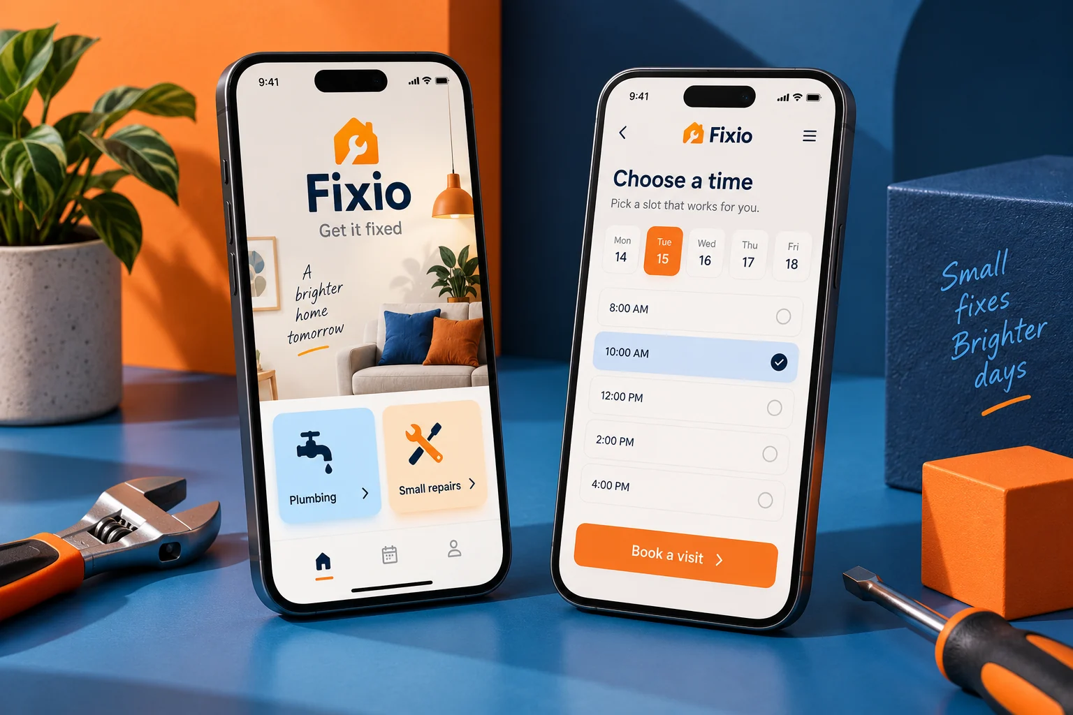
Original Fixio mobile app concept showing home repairs screens in a colourful studio compositionCONCEPT 15

HOME REPAIRS

Fixio

Small repairs. Sorted.

Request a repair, share a photo and choose a visit with a local maintenance team.

Explore this concept

An original service app for a small property-maintenance business. Customers describe the issue, view available visit windows and follow the progress of their request.

Proposed features

  • Photo-based requests
  • Visit scheduling
  • Job status updates
FixioSample app content
Explore Fixio screens

Home maintenance · local specialists

Let’s get the small things fixed.
Leaking tap

Plumbing visit · describe the leak

Start here
Loose cabinet hinge

Carpentry · small repair

Book a visit
Light fitting

Electrical work · qualified specialist

Request

Kitchen tap repair

A clearer brief, a better visit.
Problem notes

Slow drip from the cold tap

Recorded
Reference photos

Tap and under-sink connections

2 photos
Preferred window

Friday afternoon · access available

1–4 PM

Request FX302

Know who is coming and what happens next.
Estimate

Callout and proposed repair scope

Review
Specialist

Assigned after estimate approval

Pending
Job record

Photos, scope and completion notes

History

Illustrative screens and sample data for this design concept.

More inside the experience

Guided issue reports

Ask relevant questions by repair type and accept supporting photos.

Scope and estimate approval

Separate the callout charge from work requiring customer approval.

Visit coordination

Confirm access instructions and arrival windows before dispatch.

Completion records

Store job notes, receipts and follow-up questions in a single thread.

A typical user journey

  1. Describe the issue and add useful photos.

  2. Review the estimate and agree a visit window.

  3. Confirm completed work and retain the job record.

Behind the scenes

Dispatchers would assign suitable specialists, track appointments and flag scope changes. The interface would never imply a trade credential that has not been verified.

Design focus. Helping people explain a problem and understand the next step.

  • Service requests
  • Scheduling UX
  • Customer journeys
Let’s discuss your app
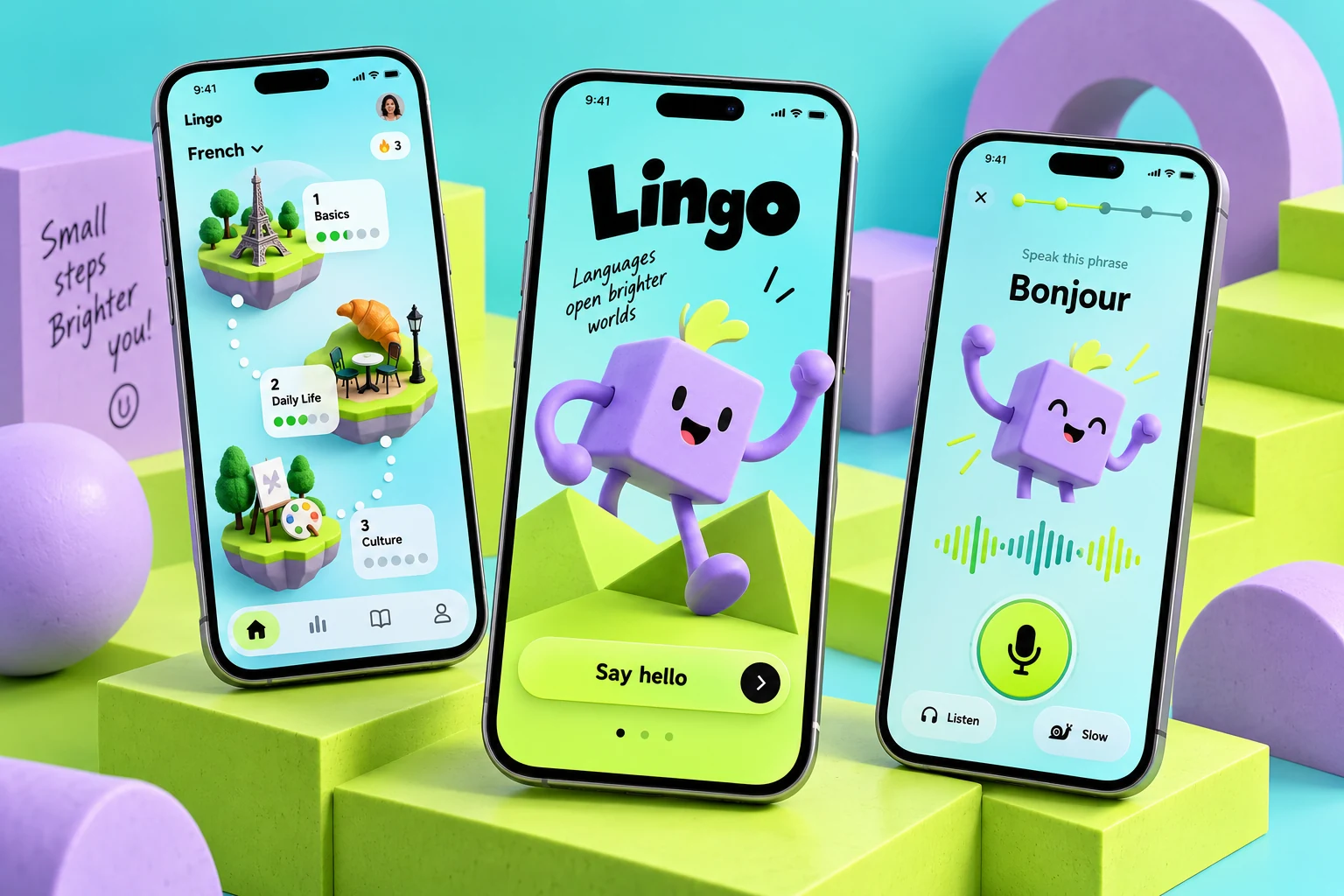
Original Lingo language-learning concept with turquoise and lime lesson screens and an original geometric characterCONCEPT 16

LANGUAGE PRACTICE

Lingo

Small lessons. Everyday confidence.

A companion app for an independent language tutor, built around practical phrases and short daily lessons.

Explore this concept

A focused learning concept for a tutor and their students. Short phrase exercises, an original geometric character and gentle progress feedback make practice approachable.

Proposed features

  • Short lesson journeys
  • Phrase practice
  • Encouraging progress feedback
LingoSample app content
Explore Lingo screens

Spanish basics · everyday moments

A few useful words for today.
At the café

Ordering and asking politely

6 phrases
Getting around

Directions and local transport

8 phrases
Meeting people

Introductions and simple questions

5 phrases

At the café · phrase 2 of 6

One conversation, one small step.
Listen

A slow, clearly spoken example

Audio
Try it

Choose the missing phrase

Exercise
Say it again

Record a practice attempt privately

Practice

This week · 3 short sessions

Keep the useful phrases close.
Café phrases

Four completed · two to review

4 of 6
Saved vocabulary

Words you marked for another look

12 words
Tutor note

Practice greetings before the next lesson

Feedback

Illustrative screens and sample data for this design concept.

More inside the experience

Short structured lessons

Group phrases around real situations with a manageable practice sequence.

Audio and pronunciation practice

Offer replay, slower examples and optional private recordings.

Personal review queue

Bring back saved and missed phrases without punishing broken streaks.

Tutor feedback

Connect exercises to a tutor’s lesson plan and specific next steps.

A typical user journey

  1. Choose an everyday situation and hear a short example.

  2. Complete phrase exercises and save unfamiliar vocabulary.

  3. Review difficult phrases and discuss feedback with the tutor.

Behind the scenes

Tutors would edit lesson sequences, upload permitted audio and review shared work. Voice recordings would remain optional, with explicit controls for saving and deleting them.

Design focus. Making repetition feel rewarding without overwhelming the learning task.

  • Learning UX
  • Interaction design
  • Progress systems
Let’s discuss your app
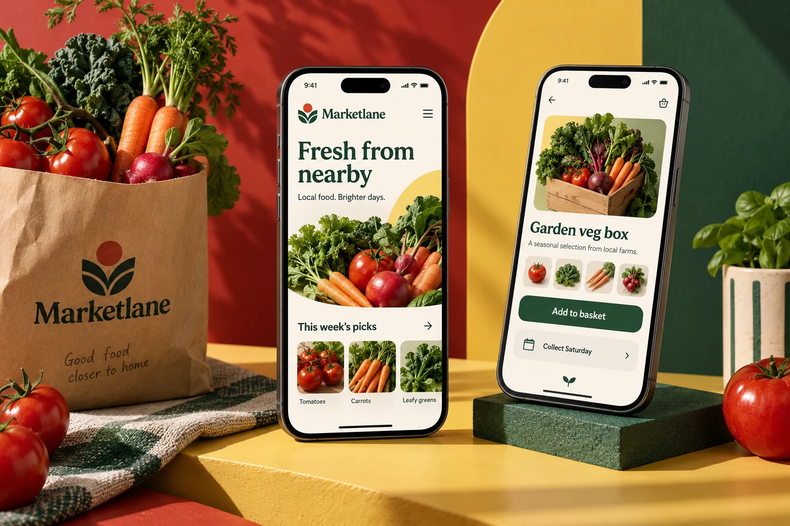
Original Marketlane mobile app concept showing local produce screens in a colourful studio compositionCONCEPT 17

LOCAL PRODUCE

Marketlane

Fresh from around the corner.

Browse a weekly market, build a small order and collect from local growers.

Explore this concept

A marketplace concept for a neighborhood farmers’ market. Seasonal listings and simple pickup information connect shoppers with a curated group of local stalls.

Proposed features

  • Seasonal stall listings
  • Pickup orders
  • Vendor profiles
MarketlaneSample app content
Explore Marketlane screens

Saturday market · 9 AM–1 PM

Fresh choices for the weekend.
Heritage tomatoes

Meadow Farm · 500 g punnet

$4
Sourdough loaf

Corner Oven · baked Saturday

$6
Seasonal greens

River Patch · mixed bunch

$3

Three items · two stalls

Your market morning, organized.
Meadow Farm

Tomatoes and seasonal greens

$7
Corner Oven

One sourdough loaf

$6
Collection

Saturday · separate stall pickups

10–11 AM

Two orders reserved

A short route through the stalls.
Meadow Farm

Row A · stall 4

Ready
Corner Oven

Row B · stall 2

Preparing
Market essentials

Bring a bag · entrances on Pine Street

Notes

Illustrative screens and sample data for this design concept.

More inside the experience

Stall-led browsing

Show the producer, unit size and seasonal availability on each listing.

Multi-stall baskets

Keep totals and collection instructions separate for each participating seller.

Stock and substitutions

Confirm reserved quantities and offer clear choices when produce changes.

Market pickup planning

Provide stall locations, collection windows and order references.

A typical user journey

  1. Browse seasonal products and learn who produced them.

  2. Reserve items from participating stalls and confirm the totals.

  3. Follow the collection list at the market and mark orders collected.

Behind the scenes

Sellers would manage available quantities and preparation status. Market organizers could publish opening changes, stall maps and shared collection guidance.

Design focus. Making seasonal availability and collection arrangements easy to understand.

  • Local marketplace
  • Food commerce
  • Catalog UX
Let’s discuss your app
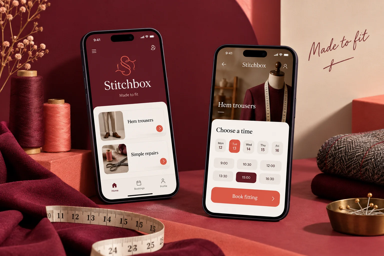
Original Stitchbox mobile app concept showing tailoring services screens in a colourful studio compositionCONCEPT 18

TAILORING SERVICES

Stitchbox

A better fit, beautifully simple.

Book an alteration, describe the garment and follow its journey back to you.

Explore this concept

A service concept for an independent alterations studio. Customers choose a garment type, explain the adjustment and arrange a fitting or collection visit.

Proposed features

  • Garment requests
  • Fitting appointments
  • Alteration status
StitchboxSample app content
Explore Stitchbox screens

Independent alterations studio

Make a favorite fit again.
Trouser hem

Standard finish · fitting available

From $16
Dress adjustment

Waist or side seam consultation

Estimate
Zip replacement

Garment inspection required

Request

Trouser hem · fitting visit

A useful brief before the first pin.
Garment

One pair of straight-leg trousers

Selected
Adjustment notes

Shorten to sit above the shoe

Shared
Fitting appointment

Tuesday · 2:30 PM

20 min

Job ST117

From fitting to the final finish.
Measurements

Confirmed at the fitting

Complete
Alteration

Hem work in progress

In studio
Collection

Expected Friday · confirmation to follow

Pending

Illustrative screens and sample data for this design concept.

More inside the experience

Garment-specific requests

Collect material, garment type and adjustment notes before quoting.

Fitting appointments

Reserve a consultation and explain what the customer should bring.

Measurement records

Keep agreed fitting measurements and reference photos together.

Approval and collection

Request approval for price changes and notify customers when work is ready.

A typical user journey

  1. Select the garment and explain the desired adjustment.

  2. Attend a fitting and approve the agreed scope and estimate.

  3. Follow progress and collect the finished garment.

Behind the scenes

The studio would track garments, fittings, work assignments and collection dates. Personal measurements and images would be accessible only to the relevant team.

Design focus. Turning a service that needs context into a clear, guided request.

  • Service design
  • Appointment flows
  • Order updates
Let’s discuss your app
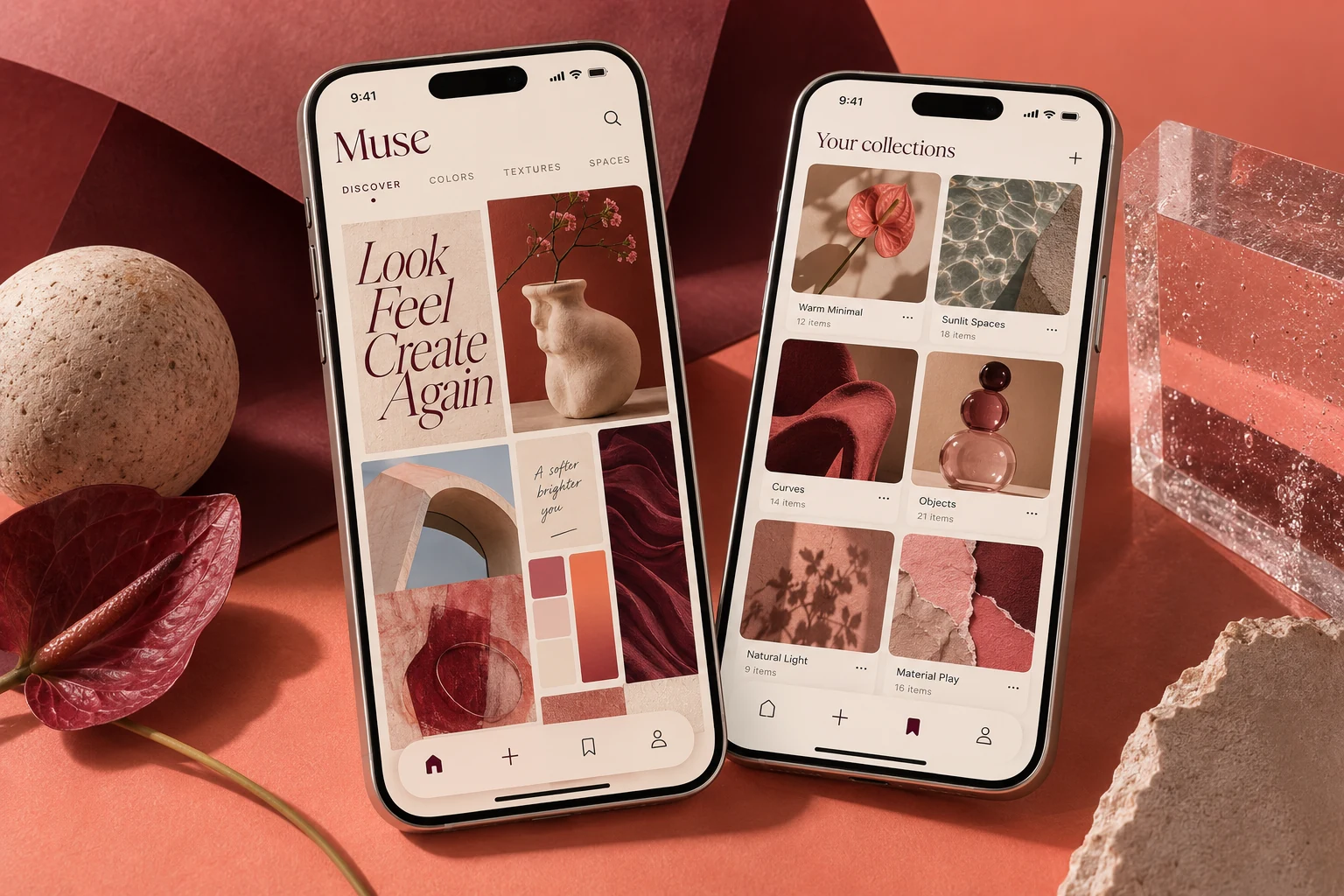
Original Muse creative app concept with coral and burgundy screens showing visual discoveries and moodboard collectionsCONCEPT 19

CREATIVE BOARDS

Muse

A little collection of inspiration.

A personal moodboard app for freelance creatives to collect visual ideas and organize their next project.

Explore this concept

A compact design tool for a freelancer’s creative process. Save an idea, group a handful of references and revisit a project board without a crowded social feed.

Proposed features

  • Visual discovery feed
  • Curated moodboards
  • Saved ideas & collections
MuseSample app content
Explore Muse screens

A small daily creative selection

Make room for a new direction.
Soft geometry

Shapes, shadows and rounded forms

Collection
City color

Contrasting details from everyday streets

Palette
Type in motion

Letterforms with rhythm and energy

Study

Studio refresh · 7 saved ideas

A direction you can actually explain.
Color direction

Coral, burgundy and warm paper

Palette
Reference note

More texture, fewer hard edges

Annotation
Group by purpose

Identity, packaging and digital

3 groups

4 boards · 19 ideas

Find the thought you saved last week.
Studio refresh

Updated today · private

7 ideas
Weekend sketches

Personal experiments

8 ideas
Quiet interfaces

Minimal digital references

4 ideas

Illustrative screens and sample data for this design concept.

More inside the experience

Curated discovery

Organize original or licensed references by technique, material and mood.

Annotated boards

Save the reason behind a reference using notes, tags and grouped sections.

Palette collections

Keep color combinations alongside the references that inspired them.

Selective collaboration

Share a board for feedback while keeping personal collections private.

A typical user journey

  1. Discover a visual idea and note what makes it useful.

  2. Save it to a board and group related references.

  3. Refine the direction and share selected work for feedback.

Behind the scenes

Editors would manage content permissions, collections and creator attribution. Shared boards would have clear access settings and removable invitation links.

Design focus. Giving visual content room to breathe while making collection and organization feel effortless.

  • Creative platforms
  • Content organization
  • Visual design
Let’s discuss your app
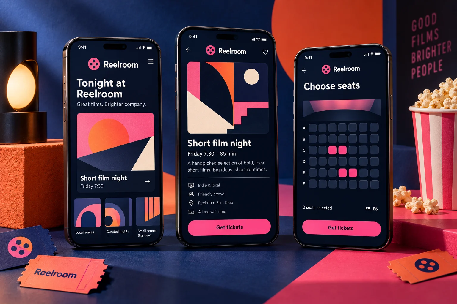
Original Reelroom mobile app concept showing film clubs screens in a colourful studio compositionCONCEPT 20

FILM CLUBS

Reelroom

A small screen. A shared experience.

Discover independent film-club nights and reserve your seat for the next screening.

Explore this concept

An original events concept for a community cinema club. A concise programme, venue details and a simple ticket flow help members plan their next evening out.

Proposed features

  • Screening programme
  • Event details
  • Seat reservations
ReelroomSample app content
Explore Reelroom screens

Community cinema club

Your next good evening out.
The Last Light

Original sample title · 98 minutes

Fri 7 PM
Letters from the Coast

Sample documentary · 76 minutes

Sat 6 PM
Shorts after sunset

Four local short films

Sun 7 PM

Friday screening · 7 PM

A seat, a friend, a conversation.
Tickets

Two club members

2 seats
Venue

Community arts hall · step-free entrance

Details
After the film

Optional discussion with the host

Included

Booking RR081

Keep the essentials close.
Entry reference

Show at the welcome desk

RR081
Arrival

Doors open at 6:30 PM

Reminder
Programme notes

Synopsis and discussion prompts

Saved

Illustrative screens and sample data for this design concept.

More inside the experience

Clear screening information

Present duration, language, age guidance and venue accessibility before booking.

Seat and ticket handling

Manage available capacity, member pricing and cancellation rules.

Event reminders

Keep doors-open time, entry reference and directions in one place.

Community discussion

Offer optional post-screening prompts and moderated member feedback.

A typical user journey

  1. Choose a screening and review the film and venue details.

  2. Reserve available seats and confirm the ticket selection.

  3. Check in with the booking reference and join the discussion if desired.

Behind the scenes

Club hosts would manage licensed screenings, seat capacity and entry lists. Film names here are fictional samples, with no implied distribution rights or partnerships.

Design focus. Giving independent events an expressive identity and a straightforward ticket journey.

  • Event UX
  • Ticketing concepts
  • Community design
Let’s discuss your app
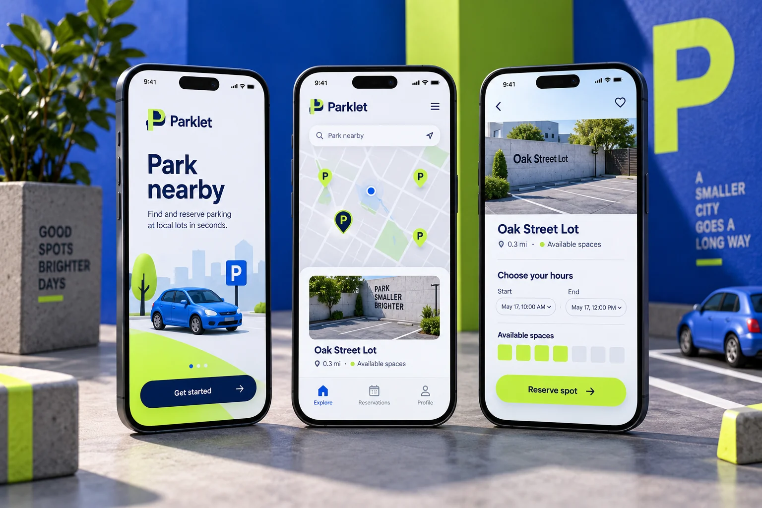
Original Parklet mobile app concept showing local parking screens in a colourful studio compositionCONCEPT 21

LOCAL PARKING

Parklet

A space waiting for you.

Reserve a parking space at a small local lot before you set off.

Explore this concept

A practical concept for an independent parking operator. Drivers can compare a few nearby locations, select a duration and keep reservation details ready on arrival.

Proposed features

  • Nearby locations
  • Duration and rate choices
  • Reservation pass
ParkletSample app content
Explore Parklet screens

Near the community arts hall

A clearer plan for the last few minutes.
Pine Street lot

0.2 miles · open until midnight

$3 / hour
Station garage

0.4 miles · covered bays

$4 / hour
West entrance

0.3 miles · accessible bays

Check spaces

Pine Street lot

Know the space before you arrive.
Arrival and duration

Friday · 6:30–9:30 PM

3 hours
Vehicle

Registration saved to your profile

Selected
Parking total

Three-hour stay · example rate

$9

Reservation PK204

The practical details, at hand.
Entry reference

Use the signed public entrance

PK204
Time remaining

Stay ends at 9:30 PM

Reminder
Need longer?

Extension depends on availability

Check policy

Illustrative screens and sample data for this design concept.

More inside the experience

Practical location filters

Compare walking distance, opening hours, height limits and accessibility.

Duration-based pricing

Show the full charge and extension rules before reservation.

Arrival guidance

Provide entry instructions and the correct reservation reference.

Stay management

Send expiry reminders and offer extensions only when space is available.

A typical user journey

  1. Compare parking options near the destination.

  2. Enter the vehicle and planned duration, then review the total.

  3. Follow entry instructions and monitor the reservation end time.

Behind the scenes

Operators would manage bay allocations, opening changes, reservations and extensions. The app would distinguish reservable inventory from general availability estimates.

Design focus. Making location, access instructions and price clear before a driver commits.

  • Map experiences
  • Reservations
  • Utility design
Let’s discuss your app
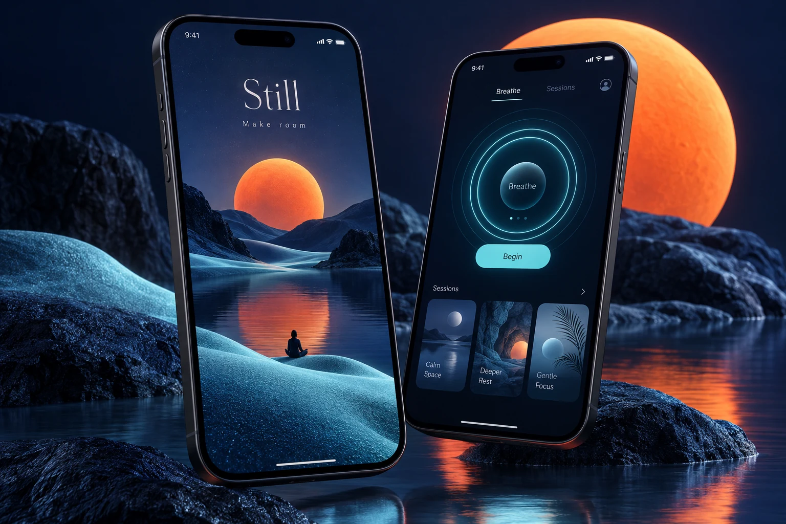
Original Still mindfulness concept with midnight-indigo screens, a warm illustrated landscape and a breathing timerCONCEPT 22

MINDFUL MOMENTS

Still

A quieter moment in your day.

A session library for an independent wellbeing studio, with short audio practices and a breathing timer.

Explore this concept

A small studio app concept offering a focused library of audio sessions. Calm navigation and a simple timer keep the experience approachable, without clinical or health-outcome claims.

Proposed features

  • Session discovery
  • A focused breathing timer
  • Personal session collections
StillSample app content
Explore Still screens

Studio audio library

A little space in the middle of a day.
A quiet start

Guided pause · soft spoken audio

5 min
Evening unwinding

Gentle ambient session

10 min
A moment outdoors

Nature soundscape

8 min

A quiet start

Settle into your own pace.
Session length

Choose a short or longer practice

5 min
Audio setting

Soft guidance with background sound

On
Finish gently

A quiet closing sound

Selected

Your personal collection

Keep what feels useful.
Saved sessions

A quiet start · Evening unwinding

2 saved
Practice note

A short pause after lunch

Private
Reminder

Optional weekday nudge

Off

Illustrative screens and sample data for this design concept.

More inside the experience

Simple audio browsing

Choose by duration, voice and sound style without clinical promises.

Comfortable playback

Offer pause, volume, session length and a clear way to end early.

Private reflection

Keep optional notes and saved sessions separate from public profiles.

Gentle reminders

Let users choose timing or turn reminders off without losing progress.

A typical user journey

  1. Choose a session that fits the time available.

  2. Adjust the audio and take the session at your own pace.

  3. Save it or add a private reflection for another day.

Behind the scenes

Studio editors would organize permitted audio, session descriptions and availability. The concept offers general wellbeing content, not diagnosis, treatment or health-outcome guarantees.

Design focus. Using colour, pacing and restrained controls to support a calm interaction.

  • Wellbeing UX
  • Audio experiences
  • Accessible interaction
Let’s discuss your app
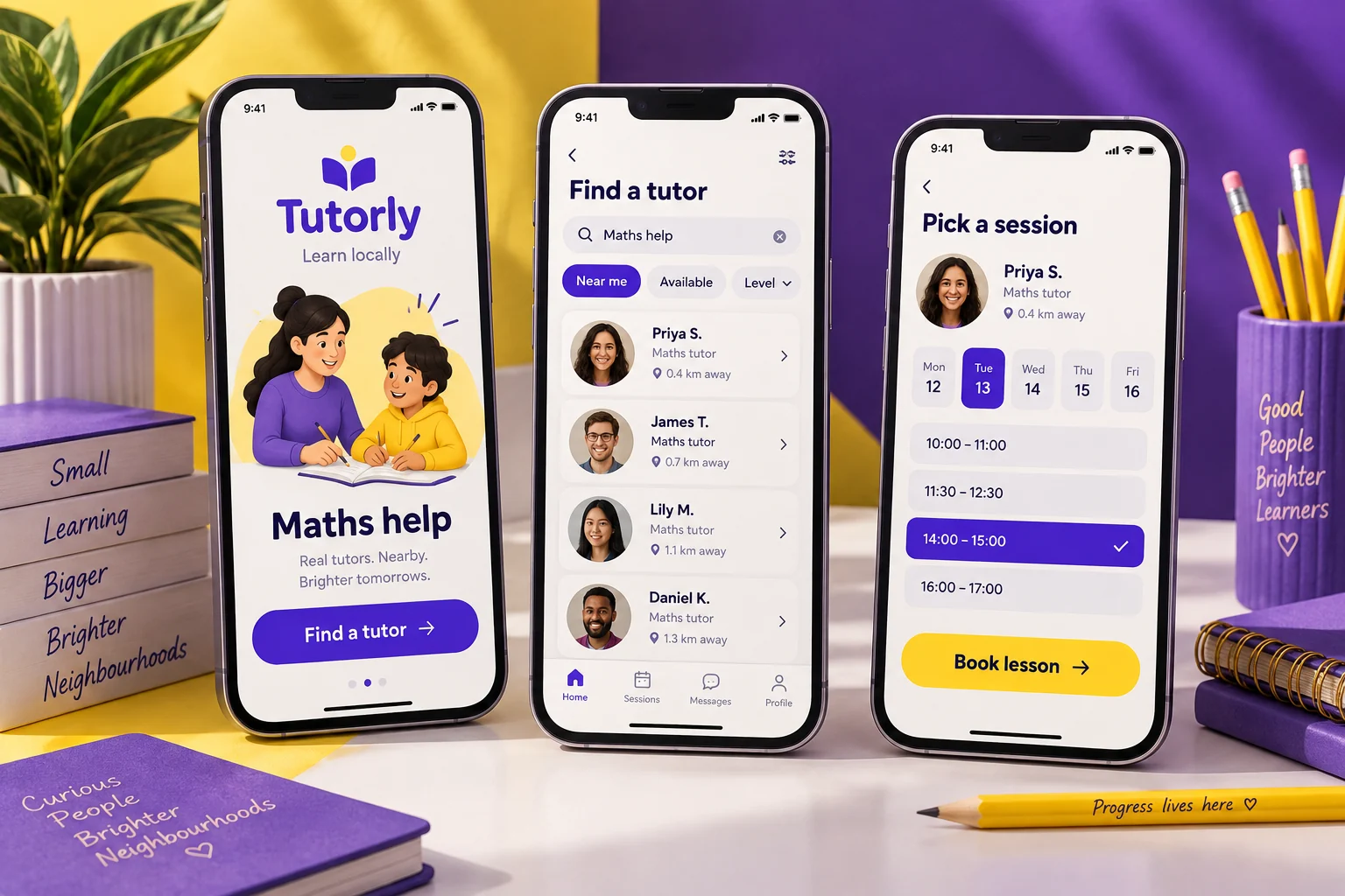
Original Tutorly mobile app concept showing local tutoring screens in a colourful studio compositionCONCEPT 23

LOCAL TUTORING

Tutorly

The right help, one lesson at a time.

Find a subject tutor, compare availability and arrange a first session.

Explore this concept

A compact booking concept for a small tutoring collective. Subject profiles and practical session details help learners choose support suited to their current goals.

Proposed features

  • Subject-based discovery
  • Tutor availability
  • Lesson requests
TutorlySample app content
Explore Tutorly screens

Small tutoring collective

A good fit for the next learning step.
Algebra foundations

With Nora · individual support

45 min
Essay planning

With Eli · structure and argument

60 min
Everyday Spanish

With Sol · conversation practice

30 min

Algebra foundations

Start with a clear learning goal.
Current goal

Build confidence with linear equations

Shared
Session format

Online · individual lesson

Selected
Availability

Wednesday · 5:00 PM

45 min

Next session · Wednesday

A useful thread between sessions.
Preparation

Bring two recent practice questions

Checklist
Shared materials

Worked example and exercise sheet

2 files
Tutor feedback

Review substitution before next time

Note

Illustrative screens and sample data for this design concept.

More inside the experience

Tutor profile comparison

Show subjects, teaching approach, session formats and verified qualifications.

Goal-based booking

Capture the learner’s current challenge before confirming the session.

Resource sharing

Keep lesson materials and preparation tasks linked to the appointment.

Progress conversations

Record specific feedback and next steps without unsupported grade guarantees.

A typical user journey

  1. Choose a subject and compare suitable tutor profiles.

  2. Share a learning goal and book an available session.

  3. Review materials and agree the next learning step afterward.

Behind the scenes

The collective would manage tutor schedules, shared materials and learner communication. Appropriate guardian consent and access rules would be required for younger learners.

Design focus. Presenting teaching focus and session details in a clear, reassuring format.

  • Education UX
  • Booking flows
  • Profiles
Let’s discuss your app
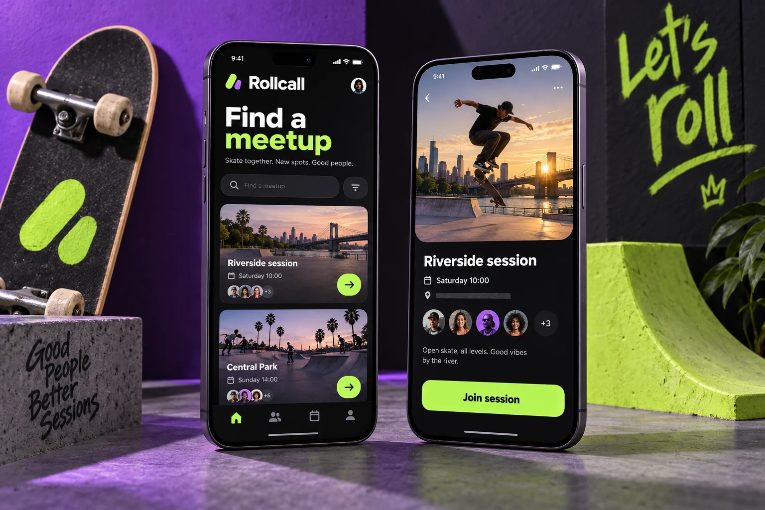
Original Rollcall mobile app concept showing skate meetups screens in a colourful studio compositionCONCEPT 24

SKATE MEETUPS

Rollcall

Find your crew. Pick a spot.

A small skate community app for sharing meetups, local spots and session plans.

Explore this concept

A playful concept for a neighborhood skate collective. Members discover welcoming sessions, check spot details and keep track of the meetups they plan to join.

Proposed features

  • Local skate spots
  • Meetup calendar
  • Session RSVPs
RollcallSample app content
Explore Rollcall screens

Neighborhood skate collective

Find a welcoming place to roll.
First push

Beginner-friendly · open practice

Sat 10 AM
Cruise the riverside

Relaxed group ride · paved route

Sun 4 PM
Flatground meetup

Skill sharing · supervised area

Wed 6 PM

Northside practice area

Know the spot before you go.
Surface

Smooth flat concrete · beginner area

Details
Facilities

Water fountain · seating nearby

Available
Session notes

Helmet encouraged · respect shared space

Read first

Two sessions saved

A few good reasons to get outside.
First push

Saturday · meet at the north gate

Joined
Riverside cruise

Sunday · route update from the host

Saved
Your preferences

Beginner sessions · relaxed pace

Profile

Illustrative screens and sample data for this design concept.

More inside the experience

Skill-aware discovery

Label events by experience level, activity type and expected pace.

Practical spot guides

Explain surfaces, facilities, access and local use restrictions.

Meetup coordination

RSVP, check host updates and receive meeting-point changes.

Community care

Provide reporting, moderation and shared-space guidance for group activities.

A typical user journey

  1. Find a session suited to your experience and interests.

  2. Review the spot details and join the meetup.

  3. Check the host’s final update and meet at the agreed point.

Behind the scenes

Organizers would publish sessions, manage attendance and moderate community reports. Spot information would be reviewed locally and would not imply guaranteed safety or permission.

Design focus. Balancing personality with clear location, skill-level and session information.

  • Community apps
  • Local discovery
  • Event planning
Let’s discuss your app
BEHIND EACH CONCEPT

The screen is only one part of the experience.

These original explorations show different visual directions. A real product also needs clear behaviour, useful information and thoughtful handling of the moments between screens.

01

Journeys with a clear purpose

Begin with the action someone came to complete: book a visit, place an order or find a local event. Each screen should help them move toward that goal.

Navigation · Task flows · Content hierarchy

02

The states people actually encounter

Plan for empty lists, a missing detail, an unavailable time slot and a successful action. Those everyday moments help an app feel dependable.

Empty states · Validation · Confirmation

03

The business behind the app

Consider who manages the catalogue, changes an appointment or answers a customer question. Operational tools are part of the product scope too.

Admin journeys · Permissions · Support

FROM INSPIRATION TO IMPLEMENTATION

Give an idea a practical next step.

A concept becomes useful when it is shaped around a real audience and business model. We can use a visual direction as a starting point, then work through the requirements together.

01

Define the first useful version

Choose the main audience, the problem to solve and the few actions the initial release must support.

02

Connect the complete journey

Map the mobile screens alongside backend services, administration, notifications and any payment or booking systems.

03

Validate before expanding

Review the prototype, test the essential flows and use early feedback to decide what belongs in the next release.

See how we structure delivery

Have a product to build or a business ready to grow?

Book your free consultation